Tuesday, 15 December 2009

Front Cover

This is my final draft of my front cover; you can see that I have added in my main image and changed the font of my main cover line.
I edited my main image quite subtly as Ollie is supposed to be a young star of only 16 and did not want her to look much older than this. I also did not feel the need to add any artificial highlights or eye colour changes. The first thing I did do when editing my main image was to cut Ollie away from the background however I did not want this cut to be sharp and obvious, to make this subtle I selected Ollie using the magic lasso tool and then opted to “feather” the image leaving the edges of my selection smooth and natural looking.
When placing the main image on to the front cover I readjusted the order of the layers to make my magazine appear more realistic. To do this I brought the layer of the masthead behind the main image and the layer containing the main cover line forward so it is seen to be on top of Ollie’s legs this makes the image look a great deal more professional.
Finally I changed the font I had originally chosen to use for my main cover line to a more graffiti style font to make it fit in with the masthead as these are the two most important pieces of text on the front cover so I tried to make a link between them by using similar fonts, however my masthead is still the most eye catching piece of text due to its positioning and font size.

Monday, 14 December 2009

Photoshoot Pictures

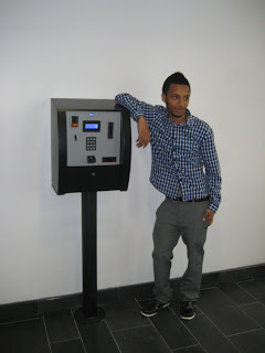
After the original location for the shoot could not be used I deliberately chose to shoot my photographs in a plain room as this would help me later on during the editing process.
The following images are the shortlisted ones; originally I decided to use the last photograph shown however after some editing I realised that for my main image on my front cover I would need a much bolder image. Although in both photographs one and two Ollie is posing in relatively attention-grabbing positions I really liked the photographs in which Ollie was wearing the fur jacket as this is a typical R&B material so I chose to use the third image shown as in this image Ollie is both wearing the fur jacket and facing the camera straight on making the image much more bold and striking.


Monday, 7 December 2009

Photoshoot Plan

This is my photoshoot plan for my front cover main image, unfortunately on the day of the shoot there was extremely bad weather so the shoot had to be conducted indoors instead of in my original photoshoot location.

Wednesday, 2 December 2009

Second Front Cover Mock-Up


This image shows my second front cover mock up, to help decide on actual positioning and effects I chose to create this mock up using photoshop. I chose the font for my masthead as it looks very similar to graffiti and as stated earlier this is one of the most common recurring themes on the R&B scene. To add to this I then used the brush tool to create a dripping effect off the end of the “D” of Bump&Grind to make this slightly more realistic I made it the same colour as the colour I used for the shadowing of my mast head, this dripping effect is also useful as it draws the eye towards my button which I have also used a brush for instead of using a conventional shape tool.
I have chosen to place my cover lines along the sides and bottom of my front cover as this will ensure they do not overlap my main image.
Throughout the mock up there is a clear colour scheme that I have strictly followed this is the one that was proved to be most appealing to people when doing my music magazine research , I have chosen to use the red to conventionalise the eye line of my magazine cover, excusing the button the red text follows the traditional “C” shape I believe this will make the reader feel much more relaxed and comfortable when looking at my front cover and therefore more likely to buy it as it is set out in a similar way to the majority of magazines.

Monday, 30 November 2009

First Front Cover Mock Up

In this front cover mock up I decided the basic positioning of my masthead & cover lines ect.

Saturday, 28 November 2009

Music Magazine Front Cover Analysis

Before creating the mock up for my own music magazine I analysed some existing ones to see if there were any recuring themes or problems with them.

Sunday, 22 November 2009

Mood Board

I made my mood board to establish the general atmosphere for my magazine...


I have included typical R&B themes such as Graffiti and Diamonds which are famously related to R&B due to the trends set by popular artists through fashion statements and re-occurring themes in music video’s;
I have also included pictures of some widely known R&B artists, Jay-z, Ne-Yo, Rihanna, Pharell & Chris Brown who are typical R&B artists.

Friday, 20 November 2009

Questionnaire Feedback Analysis

After I recieved the feedback from my questionnaires, using Miscrosoft Office Excel I transferred the feedback in to pie charts, I then used these charts to create a presentation in which I have also analysed my results
This is my Questionnaire Feedback Analysis Presentation:

Tuesday, 17 November 2009

Music Magazine Research

In order to ensure that my magazine is correctly customized to my target audience I did a little research in to which fonts they favoured, there preferred price range and what they wanted to see inside the magazine as well as many other topics. I did this by creating the questionnaire beneath....

Monday, 9 November 2009

Project Plan

For our music magazine's we have been asked to created a project plan to help us stick to a schedule in order to produce all work on time, without having to rush any aspects of the publication.
This is my project plan for my music magazine.....

TOC Presentation

TOC


Wednesday, 14 October 2009

The Process of Designing My School Magazine Cover

In this PowerPoint presentation I have included the process of how I designed my magazine cover this contains my magazine cover layout, a selection of the images from my main image photo shoot, an explanation to why I chose the image I did and a step by step breakdown of my editing process.

Comparisons of school magazines


Above I have analyised two school magazine covers.

Monday, 12 October 2009

Cloning Tool


For this task we were told to use the cloning tool on photoshop to eddit out the St. Marylebone sign up the side of the building on the picture shown above.
By pressing the Alt key whilst the mouse is carefully placed over a specific area you can begin to clone your chosen area.
I found that I got the best results by cloning out the sign using a small brush and once I had done this i used one of the larger brushes to clone out any shading that made the edditing obvious.
This is the photograph after I have eddited out the sign...


Monday, 5 October 2009

Colour Filtering


Whilst learning some photoshop skills we eddited one of our own photo's to make it look like a professional adervitsement.
We used a photograph with a white background and added a colour filter as well as a high street logo.


Magazine Cover Layout

We learnt about new codes and conventions for magazines and I have demonstrated my understanding by labeling a popular magazine cover bellow...